Legacy product re-design
the craneware group • Sep 2021 - Apr 2022 • 7 months
About
Transitioning a 20-year-old legacy application into Trisus, Craneware's cloud suite of products.
Skills developed
Stakeholder management
Running discovery phase
Conducting interviews
Building personas
Usability testing
Journey mapping
Insight gathering
UI Design
The dream team
Adrienne Sowers - Director of Payor and Pricing Analytics
Sean Hay - Senior Product Manager
Marina Metaxa - Senior UX Consultant
Gregor Gordon - Product Analyst
Andrada Habean - Product Analyst
TingTing Li - Software Manager
Noah Solomon - User Researcher
Mark Lee - Senior Technical Writer
Glossary of acronyms
CDM
CPM
PA
TPA
Trisus
Charge Description Master
Comparative Pricing Modules
Pricing Analyzer
Trisus Pricing Analyzer
Craneware's cloud platform
A file that contains every act of service a hospital offers and its respective charge code
Groups you can use within TPA to compare pricing data from other hospitals
Desktop pricing analyzer application without the Trisus integration
Desktop pricing analyzer application, evolved to offer an integration with Trisus
Where we want to move TPA to.
The problem
Pricing Analyzer is an extremely complex, 20-year-old product used by pricing analysts for the annual price increase that they perform for their health organization. The project began in September of 2021 when the requirement to migrate the application into Trisus, Craneware’s cloud platform, was first raised by product management. At this point, the desktop application had been growing in size to support many different tasks but it was lacking in performance and user experience, so much so that it looked and felt like something out of 1995.
The primary motivation behind this project was to achieve the following:
-
Improve performance by improving the tech - the application works with extremely large databases and as a result, it slows down its performance
-
Improve the user experience - it is an incredibly difficult application to navigate without prior knowledge of the product or training. There are many issues with accessibility, lack of feedback, and a lot of grey among its many other problems.
-
Meet Craneware’s goal of transitioning all legacy applications to the Trisus cloud platform and aligning it with the existing Trisus products by 2023
Stakeholder interviews
As the UX lead on this project, my first course of action was to set up a plan for the discovery phase. My first goal was to understand the pricing analyzer customers, what they are trying to achieve by using it and how it can be improved.
I kickstarted the process by interviewing 10 key stakeholders who have a wealth of experience using the product on a day-to-day basis and are well-versed with the challenges it presents. These individuals included members of product management, implementation consultants, customer support representatives and finally the VP of Revenue and Intelligence to better understand their vision for the future of TPA.
Key findings
The stakeholder interviews gave me a much better insight into Pricing Analyzer and its users, what it does well, and where it can be improved. I collected all of this feedback into a miro board which you can access below.


Personas
Looking at the data that I had gathered so far I was able to clearly identify 4 different user types. The next step was to develop these into personas. To do this, I enlisted the help of four key individuals from the Pricing Analyzer world, and along with our software manager, I ran 2 workshops to dig deeper into the frustrations they face, the main tasks they have to perform, and their needs from the product. This workshop resulted in the creation of four personas which enabled us all to be on the same page about who we were developing this product for and helped us consider different features that each user type would require from the new and improved Pricing Analyzer.

User journeys
At this point, I had a pretty good understanding of the core journey the user has to take to perform the pricing analysis task and update their hospital's prices for the new financial year. It was time to unpick this complex app and roll it back to the fundamentals.
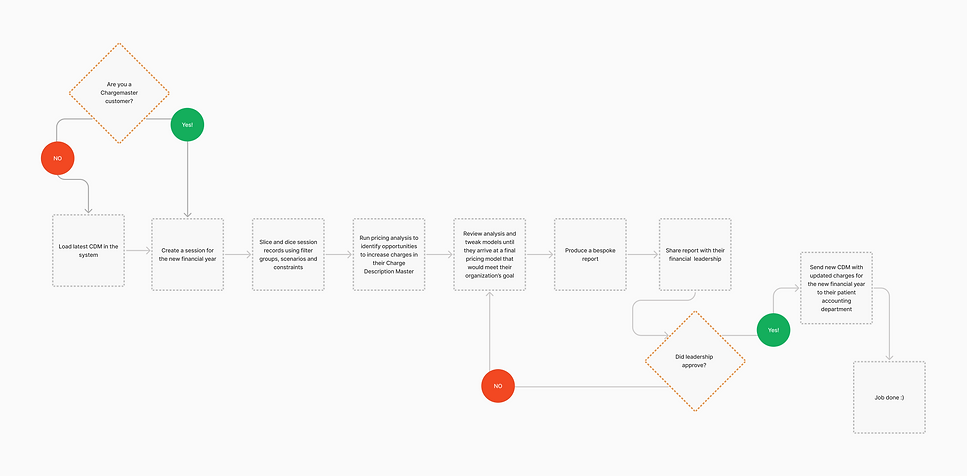
This is when the project got really fun. Gregor and I spent a number of days in FigJam where we broke down the core user journey into smaller pieces and expanded further on what currently exists within the application, reviewed which features were needed, which ones could be discarded, which ones could be improved, and documented where we saw an opportunity to innovate and enrich the experience.
This mapping method was great because it allowed us to see the bigger picture, and at the same time focus on specific areas and discuss ideas to make the user experience more meaningful and smarter than it is today. It also allowed us to document some basic to advanced requirements for each journey and made the process far more collaborative than just product management handing UX a set of requirements to work from, which historically is what used to happen.
We continued to expand on these journeys along the way. What we didn’t know at the time was that these journeys would later evolve into the main epics of the requirement drafting phase.
Do you have time to talk about my personal lord and savior, Figma?
Time-out. Around November 2021 we finally got team licenses sorted for Figma. The design team was really keen to make the move from Axure as the latter was not really suited to support the challenges we were facing as a team. This was a HUGE personal success as I have been pushing for the adoption of Figma since the day that I started at Craneware.
During the months of November and December, I took some time out of this project and kickstarted the migration process from Axure to Figma. As you might know, or maybe you don’t know, there is no plugin to easily import designs or components from A to F so this was very much a manual process. Fear not though because I was happy to do it as well as share my knowledge with the rest of the team on how to create components, set up variants, link documentation with the design system and have fun playing with auto-layout.
At the end of the 2-month transition period, we finally had a centralised component library, the majority of the design team actively using it, a couple of processes to make the most out of it, and links between Figma and the Nest - our design system.
Now, was that a waste of time? Absolutely not! Sure, the Pricing Analyzer re-design was set to the side for a bit but when I got back into it and started wireframing I had the pleasure of putting designs together at ⅓ of the speed it would have taken me in Axure.
Apologies for the interruption and shameless Figma promotion - now back to TPA!!
From caterpillar to butterfly
I don’t think there is anything more exciting than a re-design project*. There were a few areas I desperately wanted to improve:
-
The detached journeys to complete any given task. Creating or applying anything in Pricing Analyzer was confusing. The first time the app was shown to me I had to take detailed notes of where to click in order to complete the task at hand, and I found myself referring to my notes A LOT in order to get to a point where I felt comfortable navigating it.
-
There are a lot of right-click actions that you can perform on elements you’d never suspect are interactive, such as headers or my personal favorite, a static grey area under a data table that when right-clicked allows users to perform functions on the table.
-
The visual relationship and hierarchy between pricing models, filters, scenarios, and constraints. That was a UI pickle.
-
The outdated UI. The goal was to align it with the rest of Trisus but thankfully we have a comprehensive design system and at that point a handy component library on Figma so that was easy enough.
-
The copy. There were certainly opportunities to improve it and align it with the rest of Trisus.
-
Feedback loops and keeping the customer informed during the different stages of their workflow. There are many examples of this but one particular example that comes to mind is when setting up a session the user has no way of knowing if the calculation will take 5 minutes or 10 hours. Should they step away from their screen, make coffee and work on something else or should they wait for the claims data to compile? No one knows and we should probably fix that.
* I read that again. There are probably a lot of things in life that are more exciting than a re-design project but in the context of software, that is my definition of exciting.

User testing
I got stuck in with addressing the issues outlined above and put together initial wireframes for journeys 1 & 3 to use in user testing. Journey 2 was set aside for the time being as we needed more information from a different product team, so it was moved to the bottom of our priority list.
This was perhaps one of the most critical stages of the process as we were able to evaluate and challenge the assumptions we had made and discover more insights about how the customers actually use the tool. The majority of the feedback was positive, with participants commenting on how easy and straightforward the process was to complete the tasks they were given, while also highlighting the effectiveness of the various ways they were kept updated about the system’s status. Not to say there wasn’t negative feedback. This was a radical transformation with some users feeling reluctant about it, but admitting they would need more time and training to get used to all this change. This highlighted that technical documentation and onboarding guides would have to be crafted in such a way that will mitigate the expected confusion any user would feel after such a radical change in the look and feel of the tool they use daily.


This project is far from being over
But we are off to an amazing start. I am incredibly grateful and proud of the fact that I was given sufficient time to do discovery and the fact that I collaborated with product management as one team to make sense of this very complex product. This is a huge win for UX. And to be entirely honest, now that it’s broken down in the way that we have dissected it, I can admit that it’s not actually that complex. It felt incredibly overwhelming when I first started looking at it as I had no idea where to click, how to navigate around it, and what on earth it was used for. However, by working closely with product and following a user-centered design process we made it make sense.
What’s next
We are currently at the stage of finalising the requirements for epics, features, and backlogs with delivery teams picking up the work that is ready to go. The journey mapping work has been incredibly useful to the product team as these journeys essentially acted as the predecessor of the epics we have today. We still have some unanswered questions on journeys 3 & 4 which are currently being tested to give us a better understanding of what the customers are looking to do during that part of the process. We will continue to iterate, test, and iterate again while supporting the development teams that are working on the completed journeys.